Basic Setup
The Klipboard Navigation module is a comprehensive navigation system that provides desktop and mobile navigation, dropdowns, search functionality, region switching, and geo-location features.
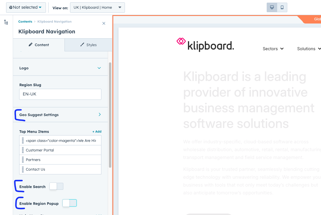
Essential Toggles
- Enable Search: Shows/hides the search icon and functionality
- Enable Region Popup: Shows/hides the language/region switcher
- Enable Geo Suggest: Activates automatic region detection and suggestions
Basic module settings with essential toggles highlighted
Logo Configuration
The logo appears in the top-left corner of the navigation and is linked to your homepage by default.
Logo Settings
- Logo Image: Upload your brand logo (SVG recommended for best quality)
- Logo Link: Where users go when they click the logo (usually homepage)
- Alt Text: Description for screen readers and accessibility
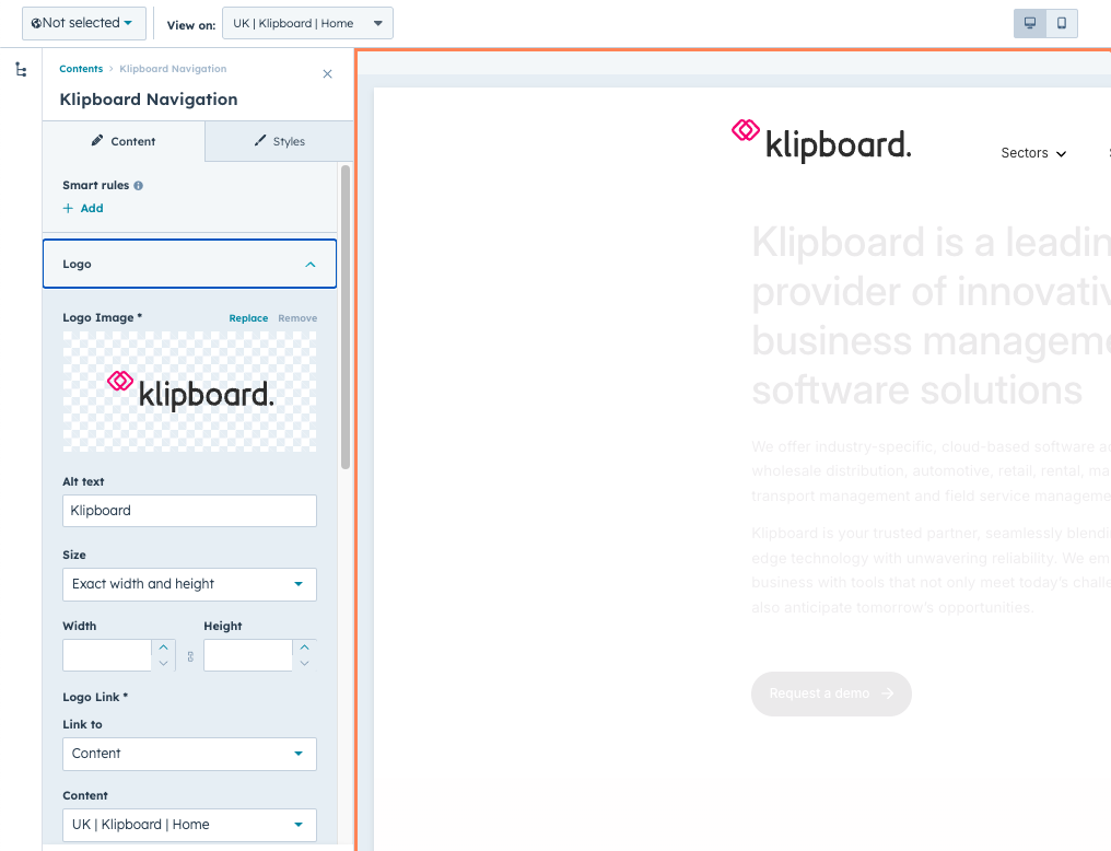
Logo configuration panel - upload your brand image here
Pro Tip
Use SVG format for logos as they scale perfectly on all screen sizes and retina displays.
Top Menu Items
The top menu appears above the main navigation and typically contains utility links like "Customer Portal", "Support", or "Contact".
Adding Top Menu Items
- Click "Add Item" to create a new top menu link
- Enter the Label (what users will see)
- Set the Link (where it goes when clicked)
- Choose if it opens in a new tab
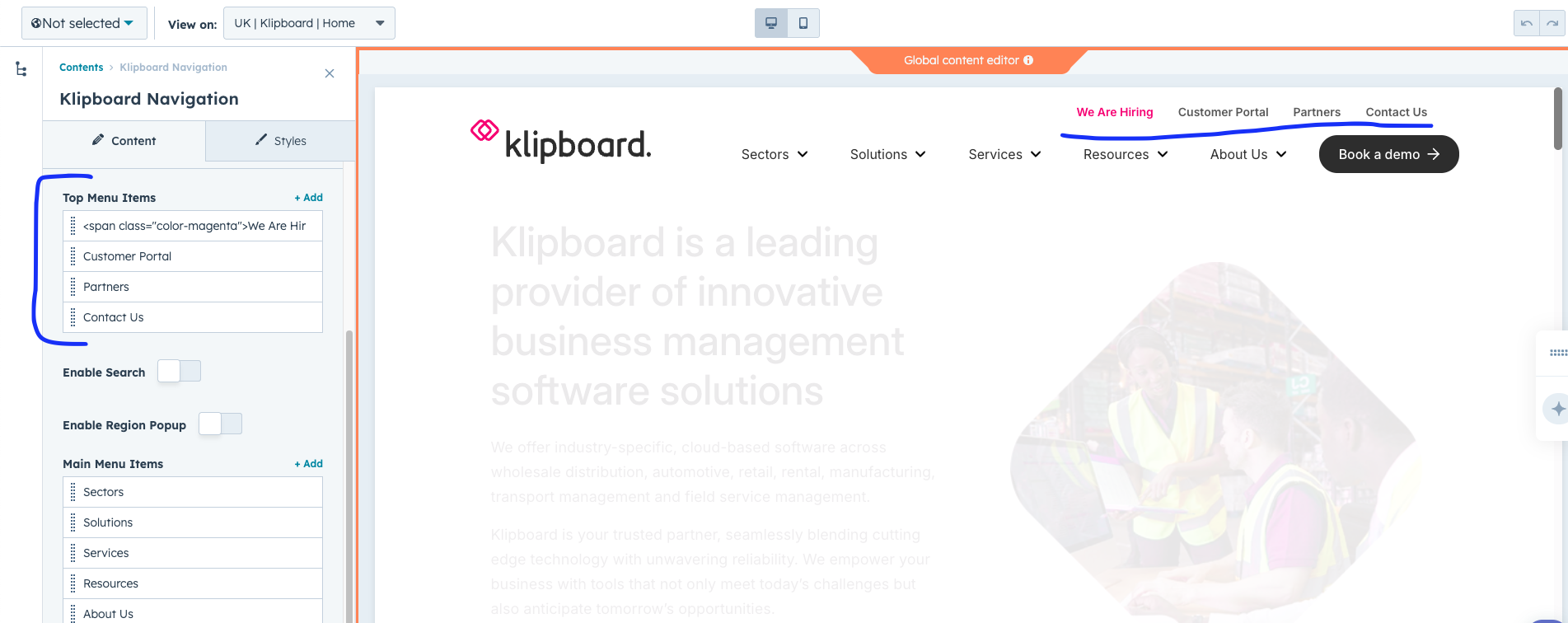
Top menu configuration - add utility links that appear above main navigation
Main Navigation Menu
The main navigation menu is the primary way users navigate your website. Each item can be a simple link or have a complex dropdown menu.
Main Menu Settings
- Label: The text that appears in the navigation
- Link: Where this menu item goes (can be a page or external URL)
- Has Dropdown: Toggle to enable dropdown menus
- Make Compact: Reduces dropdown size for smaller content
- Specific Height: Set custom height for dropdown (e.g., "600px")
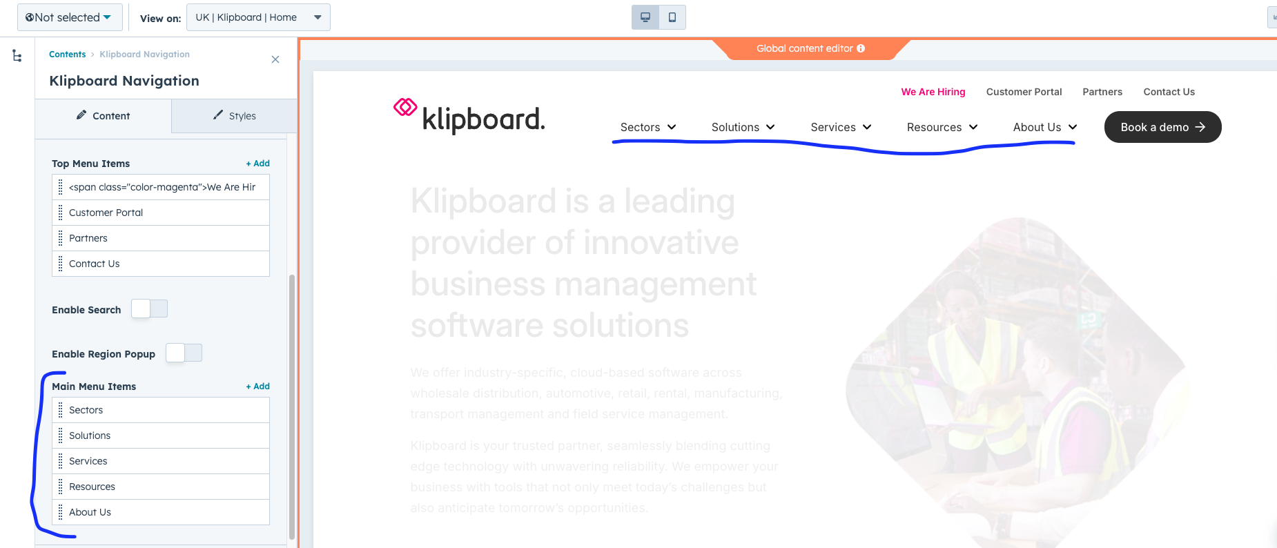
Main menu item configuration - set labels, links, and dropdown options
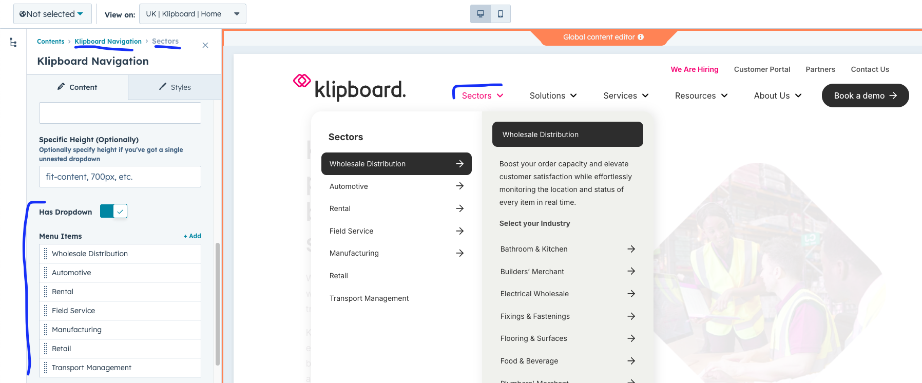
Dropdown Menus
Dropdown menus can have up to 3 levels of navigation and support rich content including descriptions, buttons, and custom styling.
Dropdown Structure
- Level 1: Main dropdown items (e.g., "Products", "Services")
- Level 2: Sub-categories with descriptions and CTAs
- Level 3: Detailed sub-items for specific topics
Level 1: Main dropdown items configuration
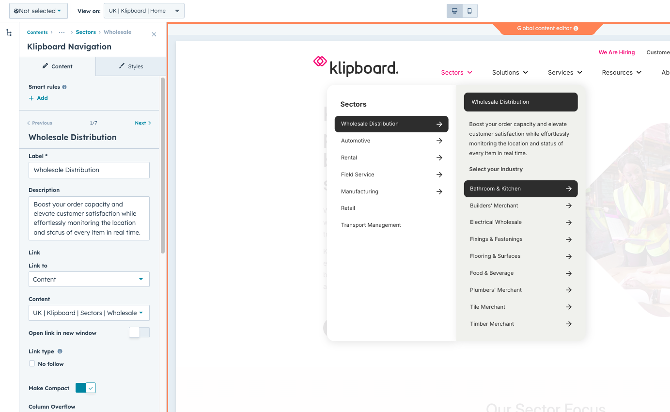
Level 2 Dropdown Features
- Sub Label: Custom title that appears at the top
- Description: Explanatory text about this section
- Discover Button: Optional CTA button with custom text
- Sub Menu Title: Title for the list of sub-items
- Has Sub-menu: Toggle for third level navigation

Level 2: Advanced dropdown settings with descriptions and CTA buttons
Complete dropdown menu as seen by website visitors
Level 3 Dropdown Options
- Item Label: Title for this third-level section
- Item Sub Label: Subtitle or instruction text
- Read More Button: Custom text for the CTA button
- Grand Children: Individual items in this third level
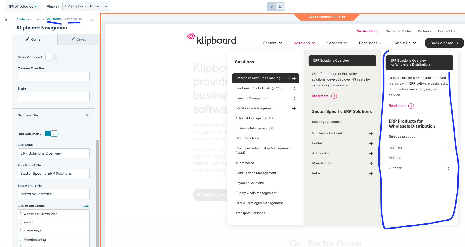
Level 3: Detailed sub-navigation configuration
Solid State Mode
Solid State mode changes how dropdowns behave, showing all levels simultaneously in a more compact layout instead of the progressive reveal.
When to Use Solid State
- When you have many navigation items to display
- For industry/product-focused navigation structures
- When users need to see the full navigation hierarchy at once
- For easier mobile navigation experience
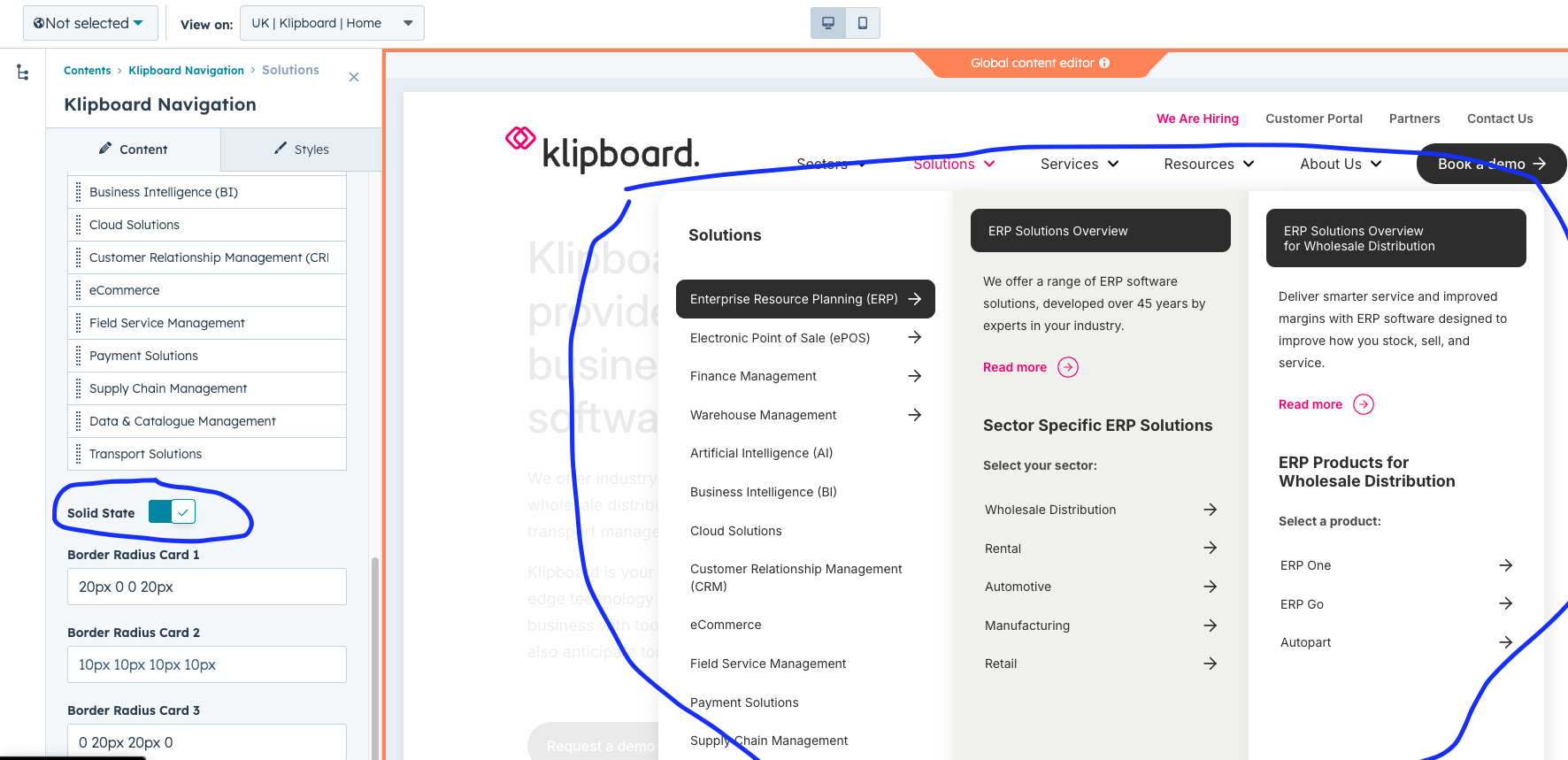
Enable Solid State mode in the main menu settings
Design Tip
Solid State works best with the "Make Compact" option enabled for cleaner layouts.
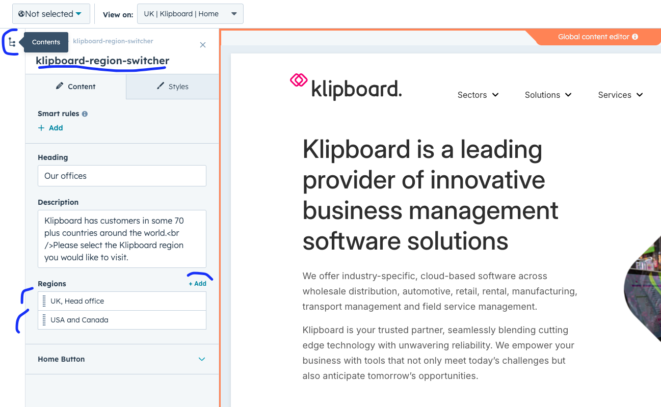
Region Popup
The region popup allows users to manually switch between different regional versions of your website. It shows a flag icon that opens a region selection popup.
Region Popup Settings
- Enable Region Popup: Shows/hides the region switcher
- Current Region Flag: Flag that appears in the navigation
- Available Regions: List of regions users can switch to

Enable the region popup in the main settings
Region flag appears in the top navigation
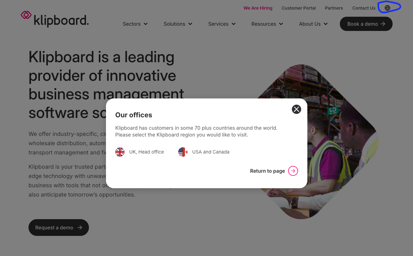
Region popup opens when users click the flag icon
Important Note
The region popup requires additional HubSpot modules to function properly. This triggers another module for the popup content.
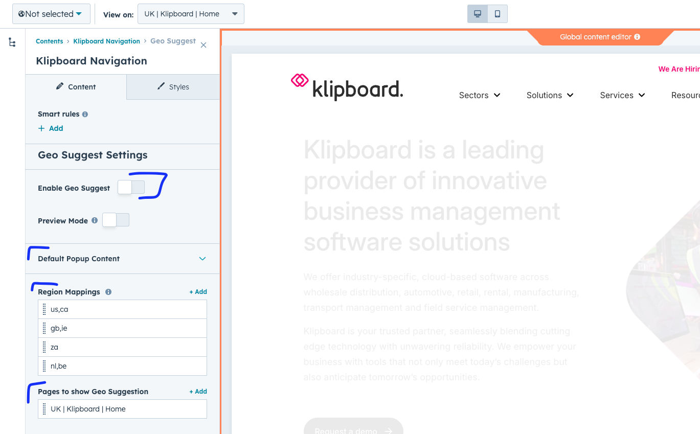
Geo Location Features
The geo-location system automatically detects where visitors are located and suggests the most appropriate regional site, or can automatically redirect them.
Geo Suggest Configuration
- Enable Geo Suggest: Activates automatic location detection
- Preview Mode: Shows the popup on any page for testing
- Region Mappings: Define which countries map to which regional sites
- Page-Specific Settings: Control behavior per page
Main geo-location settings - enable automatic region detection
Region Mappings
- Country Codes: Comma-separated list (e.g., "us,ca,mx")
- Region Name: Display name (e.g., "North America")
- Region Slug: URL path (e.g., "/en-us")
- Region Code: Unique identifier (e.g., "EN-US")
- Flag URL: Country flag image URL
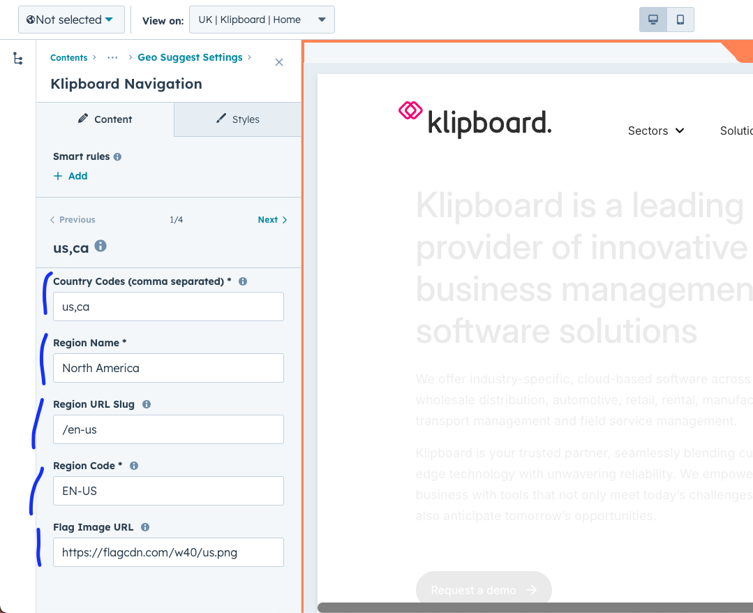
Configure which countries redirect to which regional sites
Page-Specific Behavior
- Select Page: Choose which pages show geo suggestions
- Behavior Mode:
- Show Popup: Let users choose whether to switch
- Auto Redirect: Automatically redirect without asking
- Custom Content: Override default popup text per page
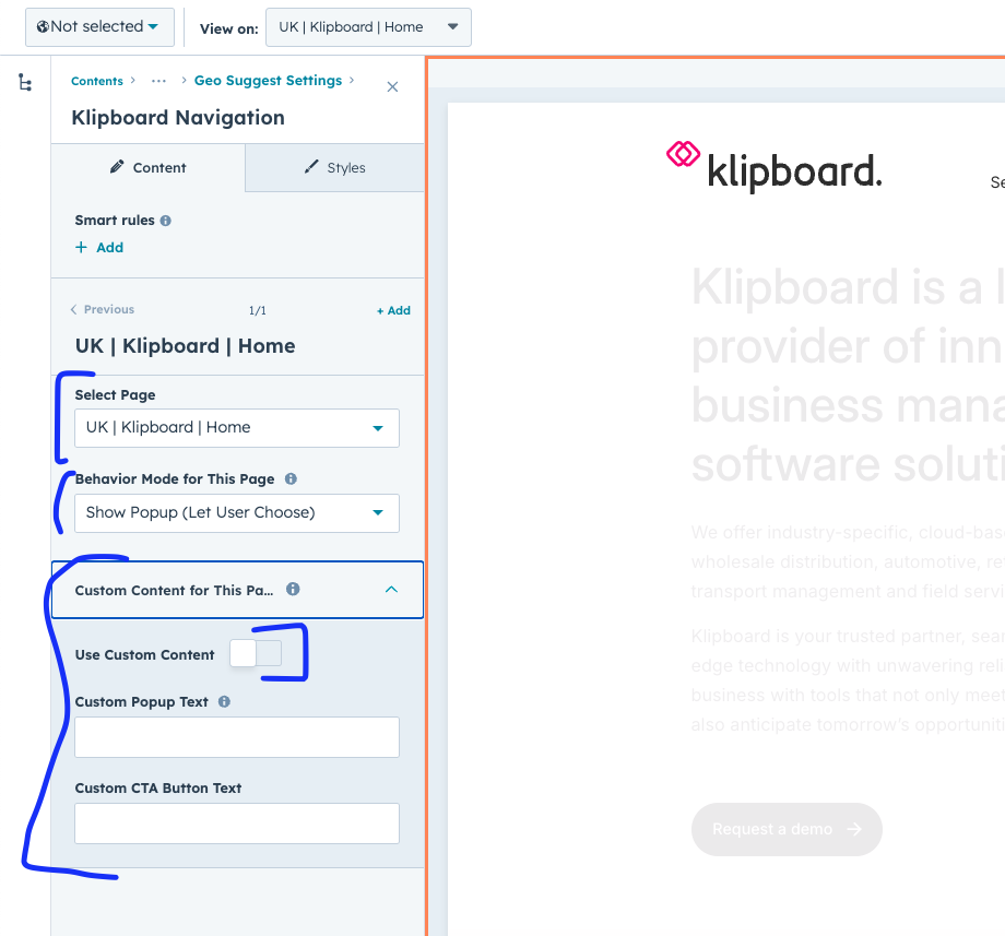
Configure geo behavior for specific pages
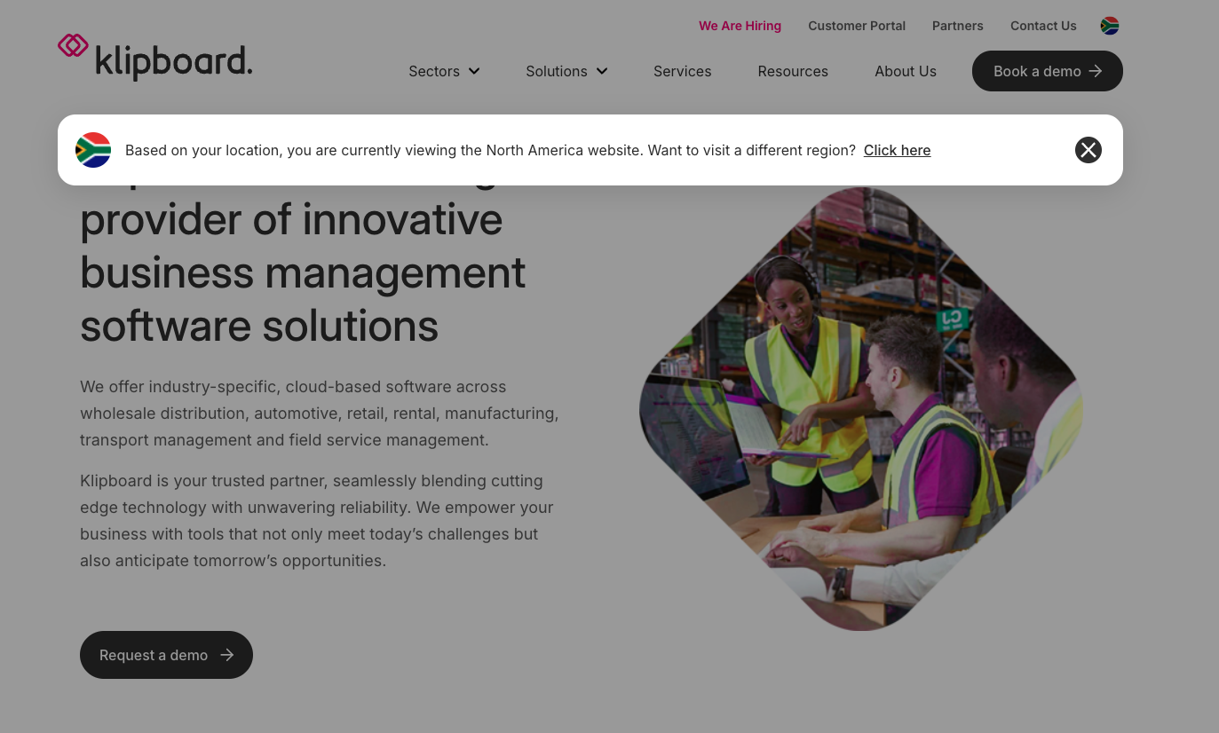
Geo suggestion popup appears to visitors from different regions
Testing Tip
Use Preview Mode to test the geo popup without being in a different country. The popup will appear on any page you're viewing.